
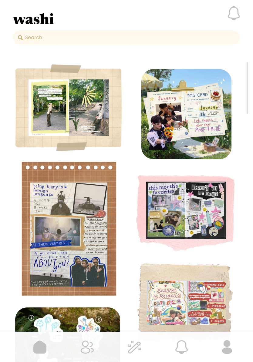
Led the design, development, and launch of a social web app that lets users create, customize, and share digital collages
Achieved a 40+ user base during its 8 hour launch period with 34 posts on the platform
Roles
Figma, Bubble.io, React, FramerMotion, Tailwind, Vite, Node, Git

Tools
Project Manager, UX Researcher, UI/UX Designer, Lead Developer
Team
Maroua Bezzaoui, Kathleen Clarke, Mai Mostafa
Course
CS278: Social Computing, 10 weeks
OVERVIEW
Washi is a collaborative collage-making platform designed to bring the nostalgia of early internet creativity into a modern, playful space. Built as part of CS278: Social Computing, the tool blends expressive drag-and-drop interactions with a lightweight social layer, allowing people to create, remix, and share visual scraps in a shared digital environment.
CREATIVE INTENT
This project explored how digital platforms can encourage open-ended creativity, low-pressure expression, and the feeling of making things together. Instead of optimizing for metrics or feeds, we wanted to design a space that feels personal, tactile, and delightfully imperfect — like crafting with real paper and tape.
This section frames the why behind the platform:
We explored how simple tools — stickers, text, washi tape, and images — can spark surprising creativity when paired with intuitive interaction design.
We aimed to design a social experience centered on creation, not consumption, where people can quickly make something and share it with others.
We questioned how collaborative tools can lower the barrier to creative play, especially for users who don’t consider themselves “artists.”
We knew going into this course that we wanted to create a social media that was engaging, unique, and centered creativity. Many of our own critiques of the most famous social platforms centered on the fact that they felt much more performative than it felt expressive—the original purpose of social media. We took that inspiration and created the first sketches and mockups of Washi.
OUR FIRST ITERATIONS
A creative social platform


Initial Sketches and Exploratory Mockups
Final mockups after brainstorming
After conceptualizing the platform, we had one primary point of contention: what should it be on? This was the main question we sought to answer with our experience prototype. For this, we had pairs of users make collages together on Laptops, iPads, and Phones to see which most allowed users for creative expression. Through this, we found that users felt they had much more creative freedom with the Laptop prototype, as it allowed them to crop, copy, and find external images easily.
EXPERIENCE PROTOTYPING
Finding the right medium
DESIGN CHANGES & ITERATION
Creating a space for self-expression
We noticed through this that many of our initial mockups simply did not align with the kind of user interaction we were striving for. Our users were creating fun, silly, and expressive content, but our mockups showed a much more serious, aesthetics-based platform. Our design language had to change in order to match the environment the users were naturally creating.
IMPLEMENTATION
This project was implemented in two parts:
Bubble was used for a majority of our functionality and UI. Thanks to its front and backend workflows and vast library of design elements, we were able to primarily develop this application with it, allowing us to focus the majority of our time and resources on our custom component, the collage editor.
The Collage Editor was made with React and is available via this GitHub Site and Repository. This was coded in JavaScript and was the primary usage of my time during implementation. I also used some public libraries such as Tailwind for UI and Framer Motion for dragging and dropping, as well as Vite for deploying. The collage editor as it is made in the code facilitates drawing, tapes, stickers, image upload, text, and capture.
I was responsible for the creation of the college editor as well as much of the Bubble functionality, if you would like to ask me more about how I created these things, feel free to reach out to me via the contact form!
OUR FINAL PROJECT DEMO
Everybody’s creative
Washi — a collaborative collage-making platform designed to bring the nostalgia of early internet creativity into a modern, tight-knit space
REFLECTION
Washi launched to 42 users who made 34 posts over the course of 8 hours. This was double the CS 278 requirement for our launch, and nothing could make me happier.
I think what I loved the most about Washi was how it pushed me. It is through making this that I taught myself Javascript. It is through making this that I experienced launching a platform for the first time despite something like that feeling incredibly out of my reach. It is through this that I got to see the impact of my work for the first time, and people loved it. They thought it was incredibly fun, and nothing could make me happier.
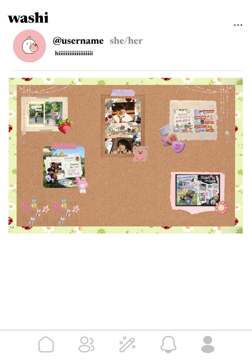
If I were to continue my work with Washi, I would want to push it to its very highest potential. I would want to iterate on the design, to include features we had to forego for the sake of launch, such as the personal bulletin board which you can decorate on your profile or the ability to click-in and explore other people’s collages more closely. I would happily work on Washi again in the future, and I am grateful for everything it taught me.
