

Co-led the early design, research, and development for PONG’s IOT-pairing coffee companion app
Deliverables: Completed UI/UX design, high-fidelity prototype (100k+ lines of code), comprehensive solution documentation for the Extracion app
Roles
Researcher, UI/UX Designer,
Frontend Developer,
Lead Backend Solution Developer
Tools
Figma, ReactNative, Expo, AWS, Google Cloud, Supabase, Meta Developer Tools, Shopify API, Node, Git
Team
Wing Chan, Lachlan Lai,
Mai Mostafa, Helen Wong
Internship
PONG Mobile App Research &
Development Internship, 10 weeks
OVERVIEW
PONG is a product design startup based in Hong Kong dedicated to creating products that are interesting, functional, and beautiful. This project is related to their most recent, RedDot award winning design, Extracion—a smart coffee maker that teaches you how to brew your perfect cup of coffee. The app provides users with personalized tools to explore coffee culture—ranging from smart brewing and café discovery to coffee diaries and loyalty rewards. The goal was to create a seamless ecosystem connecting users, partner cafés, and IoT coffee devices through a clean, intuitive interface.
PROBLEM SPACE
PONG’s new hardware needed a companion app that could guide users through brewing, teach them about their coffee, and surface dynamic content from partner cafés. But early app designs suffered from unclear flows, inconsistent UX, and unreliable BLE interactions—making a seamless, real-time brewing experience impossible.
SOLUTION PREVIEW
INITIAL DESIGN
Before: Overwhelming & Fragmented
When we first joined the team at PONG, the design system felt visually heavy and conceptually disjointed. We knew very early on that this design was not user-friendly. So we took it upon ourselves as a team to fundamentally redesign the whole product. From color palettes to layouts to the fundamental user experience, we reworked the entirety of the original app design with one goal in mind: to make coffee culture feel approachable.
.
+30%
improvement in task efficiency
Users completed key flows (logging brews, finding cafés) noticeably faster after the redesign.
Increased
perceived clarity and trust
9 out of 10 test participants described the new interface as “much cleaner” and “easier to navigate.”
Reduced
cognitive load on the user
Simplified layouts and improved hierarchy helped users complete actions with fewer errors and less hesitation.
Improved
consistency of the design system
Unified spacing, typography, and iconography across all modules built a stronger, more cohesive brand identity.
Bridged
the digital and physical
by mirroring the tone and materials of the physical product, the app now feels like a true companion to the brewing ritual.
DESIGN ITERATION
After: Calm, Guided, & Human
We wanted this app to truly feel like your companion, to capture the warmth and creativity of coffee culture, to feel like a calm guide rather than a technical tool. Our north star was approachability: to make every interaction feel natural, intentional, and grounded in discovery. This meant reducing visual noise, clarifying hierarchy, and designing an experience that teaches and delights as users brew, scan, or explore.
IMPACT
RESEARCH & DEVELOPMENT
Building from the ground up
Through continuous iteration and close collaboration between design and engineering, Extracion’s research phase evolved into a polished, user-tested MVP that delivered the app’s core promise: a connected, personalized coffee ecosystem. Each feature was developed with modular scalability in mind—laying the foundation for machine learning–powered discovery, merchant analytics, and fully integrated e-commerce experiences in future releases.
OUR DELIVERABLES
1. Evolved Design System
Following iterative user testing and feedback from our pilot sessions, we refined the app’s visual and interaction language into a cohesive design system.
The updated interface emphasized clarity, warmth, and minimal friction, consistent with the sensory, slow-living values of coffee culture.
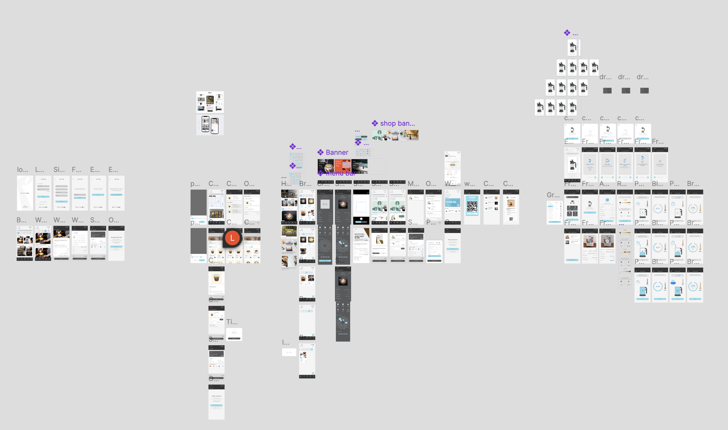
2. High-Fidelity Prototype and Frontend Implementation
Our high-fidelity prototype, built in Figma and implemented in React Native (Expo), represented the complete user journey from home feed to brewing visualization.
The final frontend integrated real data and interactions, allowing users to:
View cafés, coupons, and news dynamically from AWS
Connect to the physical coffee maker via BLE and visualize brewing metrics
Record each session in their Brew Log
Browse products and exclusive deals in the Shop and Rewards tabs
Navigate a cohesive visual language across light and dark modes
The implementation merged interaction design and production code, demonstrating how user experience decisions translated directly into live app features.
3. Solution Documentation
We compiled a complete 120+ page Solution Documentation Report outlining the final system architecture, technical specifications, and implementation plan for Extracion.
This document bridged design intent and engineering execution—detailing backend structure (AWS, React AsyncStorage, Instagram API, Shopify integrations), frontend data flow, and future development milestones.
It served as both a handover guide for engineers and a reference document for stakeholders to understand how the Extracion ecosystem operates across app, hardware, and partner platforms.
Key inclusions:
Backend architecture and API schema overview
BLE and IoT data flow between the Extracion device and mobile app
Frontend navigation map and database schema alignment
Future roadmap for feature scaling (LLM search, merchant portal, analytics)
REFLECTION
Working on Extracion was unlike any other project I’ve been part of. It wasn’t just an app—it was an entire ecosystem: connecting IoT hardware, a multi-vendor backend, a partner café network, and a growing community of coffee enthusiasts. Being entrusted with such a complex, high-stakes system as student designers and developers was both humbling and exhilarating. It challenged us to think beyond interfaces and design with scalability, security, and real-world partnerships in mind.
The project taught me how to balance creative vision with technical execution. Every decision, whether it was refining a screen transition or structuring our data models, required us to collaborate across disciplines and anticipate how design and engineering would coexist. I’m deeply grateful to have been trusted with that level of responsibility and autonomy.
But more than anything, what made this project special was the team. Our small but passionate group spent long days debugging, designing, and laughing together, often over actual cups (or cans) of coffee. We built not only a product, but also a shared sense of purpose and friendship. Those moments of late-night brainstorming, spontaneous breakthroughs, and collective pride when we saw the app running on a physical device are memories I’ll always carry with me. I look forward to our online Monopoly matches every week, and I am incredibly grateful to have not only had the opportunity to work with such passionate, phenomenal people, but to now call them my friends.
Extracion reminded me why I love building things: not just for what they do, but for the people and stories behind them. It was a project defined by trust, creativity, and connection, both in its design and in the team that brought it to life.
