

Led 0-1 design and development for a guided eating disorder recovery application
Won Best Concept and Second Best Overall out of 30+ projects and 120+ students
Roles
Project Manager, UX Researcher, UI/UX Designer, Frontend Developer
Tools
Figma, ReactNative, Expo, Node, Git
Team
Ava Love, Elton Manchester, Mai Mostafa, NaYoung Son
Course
CS147: Introduction to Human-Computer Interaction Design, 10 weeks
OVERVIEW
FoodWise is an application designed to help users whilst they are in eating disorder recovery through a personalized recovery roadmap. With a stress and mood tracker, fully customizable toolbox catalog of go-to coping skills, and an emergency help feature for times of relapse, the app equips the users with knowledge and skills for true and sustainable healing.
FoodWise was honored at the Stanford Design Thinking for User Experience Project Expo at the end of the course, receiving 1st for Best Concept and 2nd for Best Overall Project (out of 120+ students and 30+ teams).
PROBLEM SPACE
The FoodWise problem space centers on how we can use technology to support and educate individuals in eating disorder recovery—helping them rebuild self-trust, mindfulness, and healthy eating patterns through empathetic, educational, and reflective digital design, rather than surveillance or self-punishment.
SOLUTION PREVIEW
FoodWise integrates lesson modules, introspective journaling, grounding exercises, and mood tracking into a slow, supportive flow designed to reduce anxiety around food.

NEEDFINDING
We conducted five in-depth interviews with individuals who had experienced disordered eating to understand their motivations, setbacks, and recovery processes. Each interview was conducted with care and ethical sensitivity, ensuring comfort and consent.
Key insights we noticed
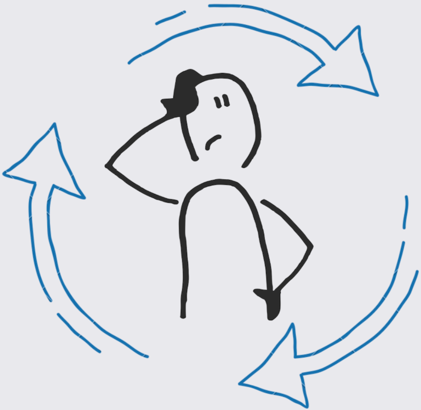
Stress & Motivation Cycles
Recognizing that eating disorder recovery is multifaceted and complex, we interviewed individuals from a wide variety of ages, backgrounds, and stages of treatment. We culminated our findings with two primary points of view.

Misinformation & Perfectionism
Online misinformation and “all-or-nothing” thinking intensified guilt, worsened setbacks, and made recovery harder to sustain.
User Persona: Juhee
College Senior in Eating Disorder Recovery
Limited Access to Support
Therapy and reliable guidance were frequently inaccessible or unaffordable, leaving people
without consistent help.
Emotional & Body-Image Challenges
Effective recovery required strong emotional regulation skills, coping tools, and continued
support for body-image struggles.
Finding the balance
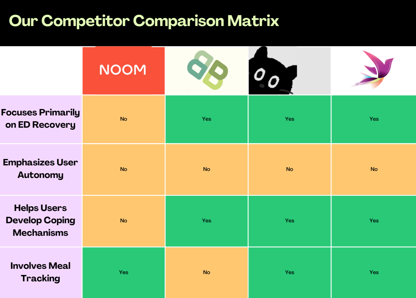
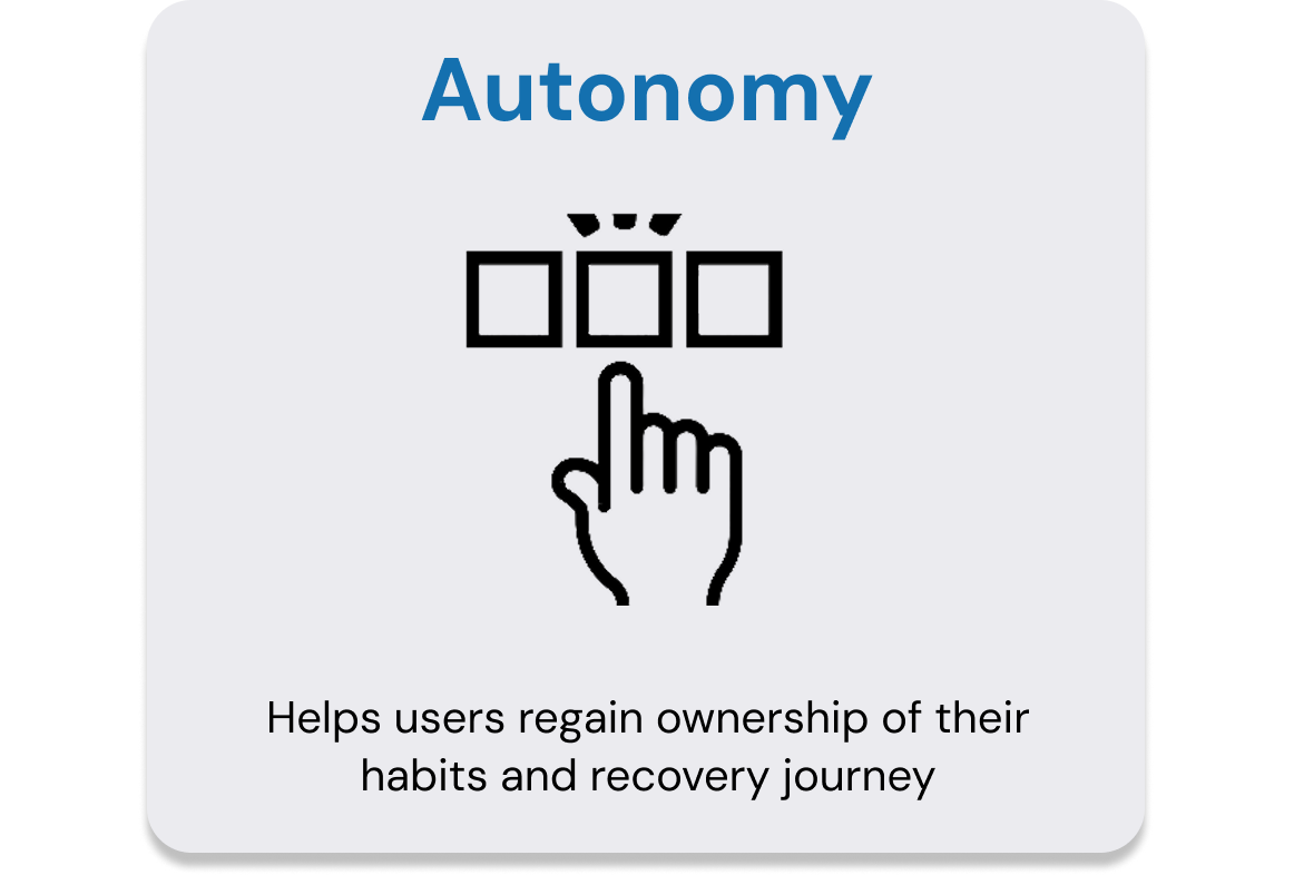
Our competitor analysis revealed that current eating disorder recovery platforms either lack user autonomy, rely heavily on meal tracking, or fail to build emotional coping skills—highlighting a clear opportunity for a more holistic, user-empowering recovery experience.
Stress, overwork, and fluctuating self-motivation
often triggered relapse patterns and disrupted
recovery progress.
MARKET RESEARCH
TARGET USERS
Designing for a wide-range of users
Background
Juhee is a college senior from Korea with a long history of bulimia shaped by intense cultural beauty standards. She holds herself to extremely strict expectations around eating and weight loss and often compares herself to others. Despite these pressures, her eating habits noticeably improve when she has trusted company suggesting that social connection plays a stabilizing role in her recovery.
Frustrations
When alone, Juhee is more likely to fall into all-or-nothing thinking around food rules. Breaking these rules triggers intense guilt, which often leads to cycles of binging and purging. Stress, comparison, and isolation amplify these relapses. She feels stuck in a loop where perfectionism and shame override her desire to heal.
Key Insights
Juhee’s eating disorder behaves like an addiction triggered by
emotional stress and intensified by isolation. Her recovery is
strongly tied to her social environment: she is significantly more stable when she feels supported and less vulnerable when she isn’t navigating recovery alone.
Opportunities
Designing a system that provides consistent, nonjudgmental
companionship—through peer support, community presence, or even digital companionship—could dramatically reduce relapse triggers. Increasing access to support system throughout her healing journey could act as a reliable, protective layer in her recovery process.

User Persona: Jill
College Junior Experiencing Anorexia
Background
Jill is a college junior from Philadelphia with a history of anorexia and, more recently, bulimia. At her lowest point, she consumed around 300 calories a day while walking nearly 12 miles. Though she intellectually believes her eating disorder is “wrong,” her self-image remains tied to a target weight based on comparisons to peers in her sorority.
HOW MIGHT WE
Frustrations
Jill derives self-worth from how thin she is and often fixates on the areas where she feels she doesn’t meet beauty standards. Comparison to others is a constant mental soundtrack that drives unhealthy behaviors. Even in recovery, her motivation is anchored to appearance rather than well-being.
Key Insights
Jill’s core struggle lies in the conflict between what she knows (that her disorder is harmful) and what she feels (that thinness equals worth). Her eating disorder is fueled primarily by comparison and external validation.
Opportunities
A recovery system that shifts Jill’s focus from weight and appearance toward health, strength, and internal well-being could be game-changing. Tools that help reframe self-worth away from comparison—and toward holistic health—would support meaningful, long-term healing.
From our points of view, we generated over 30+ How Might We statements. The one we chose to focus on and primarily inspired our solution was “How might we break the cyclical nature of disordered eating and relapse?”
Breaking the cycle
EXPERIENCE PROTOTYPING
Using quick experience prototypes, we pressure-tested our assumptions and surfaced the real support users look for in recovery.
Testing early assumptions
LOW-FIDELITY PROTOTYPING
Taking our insights from our experience prototypes, we refined our concept and went foward with low-fidelity prototyping and user testing. We tested 3 primary taskflows with four users who have a history with disordered eating.
MEDIUM-FIDELITY PROTOTYPING
Refining our concept
We took our insights and transitioned to digital, building an interactive Figma prototype. We shifted our taskflows and expanded our app structure to include five roadmap stages: Awareness, Understanding, Emotional Regulation, Self-Compassion, and Maintenance, inspired by the addiction recovery frameworks of G-CHIME and ETM. Each are represented by a unique shop with a unique shop owner.
You can read more about our Medium-Fidelity prototype in our README
HIGH-FIDELITY PROTOTYPING
Our final revisions
Using React Native and Expo Go, we built a functional cross-platform prototype with consistent branding and navigation. Based on our heuristic evaluation, we refined the experience to address the most pressing usability issues.
You can read more about our High-Fidelity prototype in our README
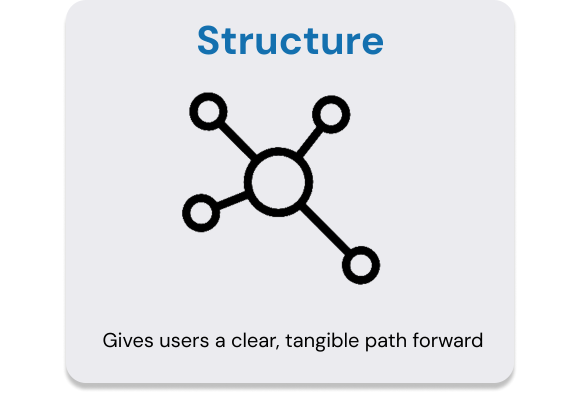
DESIGN VALUES
Grounding our work
With our concept and iterated upon design, we centered our work around four core design values, principles that shaped every decision we made.
Testing initial taskflows
Our Design Process is also fully documented on our website! There you can find our reflections from user interviews, prototyping and testing solution ideas, our final low, medium, and high fidelity prototypes, and our final report.
https://hci.stanford.edu/courses/cs147/2024/au/projects/Technology-for-Mental-Health/FoodWise/
CONCEPT VIDEO
We produced a concept video to share our design story, capturing the vision behind our solution. This video later won awards for Best Location and Most Consistent Values.
Conveying our story
OUR FINAL SOLUTION
The holistic recovery companion
FoodWise is a fun, personalized recovery app that turns stressful eating moments into guided opportunities for reflection, grounding, and growth. It helps users build sustainable habits through calming lessons, supportive journaling, and accessible coping tools.
SOLUTION HIGHLIGHTS
1. Gentle Confidence Building
Affirmations, progress cues, and compassionate micro-interactions that reinforce healing and reduce “all-or-nothing” thinking
2. Calming, guided reflection
A slow, supportive journaling experience that helps users process emotions without overwhelm or pressure
3. Tools for grounding and regulation
Quick, user-curated grounding prompts that interrupt stress cycles and support emotional stability in difficult moments
IMPLEMENTATION
Our final prototype was developed in React Native and deployed through Expo Go, enabling seamless testing across iOS and Android devices. The full implementation is open-source on GitHub.
We translated our Figma designs directly into code, carrying over the same soft palette, typography, and warmth that defined the app’s visual identity. Each page—the Toolbox, Roadmap, Tracker, and Emergency Assistance—was built as its own interactive environment, guiding users through the same structured yet compassionate journey we envisioned in our storyboards.
To simulate the feeling of a complete, living product, we used Wizard-of-Oz elements like pre-filled tracker data and placeholder lesson videos, allowing participants to experience the rhythm of recovery FoodWise encourages: reflection, learning, and growth through gentle guidance.
REFLECTION
CS 147 was my first time really delving into human-computer interaction design, and I couldn’t be more grateful for that. This is hands down one of, if not the best, class I’ve taken at Stanford.
From start to finish over 10 weeks, the course guides you through every aspect of creating an app. It is through this course that I learned how to conduct my first user interview, how to identify pain points, how to create a comprehensive solution, how to make and test prototype. It was my first time genuinely learning how to engineer a solution.
I look back on this course and project with the utmost pride and fondness. At a time when I was unsure of what I wanted, FoodWise came and showed me that I am capable. That not only do I have the passion for design, but the ability for it as well. Although my imposter syndrome is certainly not cured (whose is), this project gave me the first real chance to show what I can accomplish. Not only to others, but to myself.
FoodWise won Best Concept and 2nd Best Overall at the Design Thinking for User Experience Project Expo at the end of the course. If I were to expand on this project, I would love to develop the methodology behind the recovery process we created more. With more substantial research, I sincerely believe this could help many, many people. I would love to see it through one day.
